The Challenge
DTP shipping solutions is a fictional logistics and transportation company specializing in providing efficient and reliable shipping solutions to businesses of all sizes. With a reputation for excellence in customer service and an extensive network of transportation partners, DTP shipping solutions is committed to helping companies streamline their shipping processes and reduce costs.
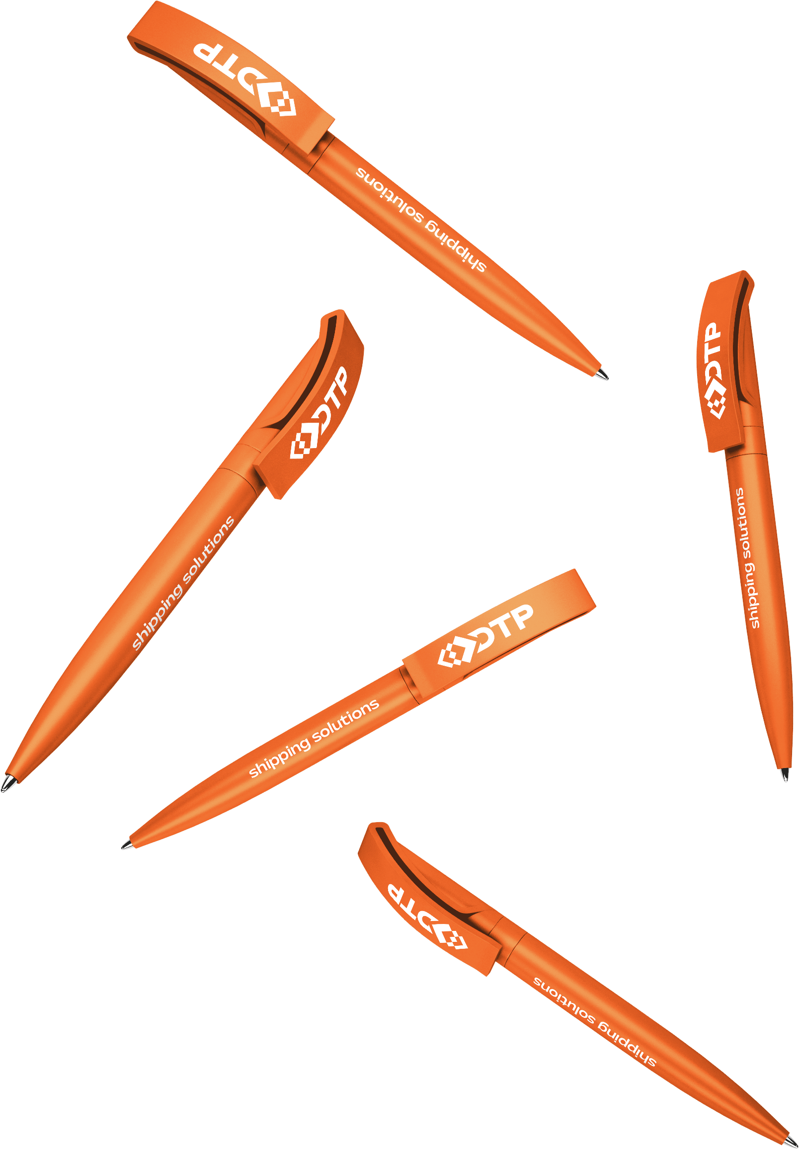
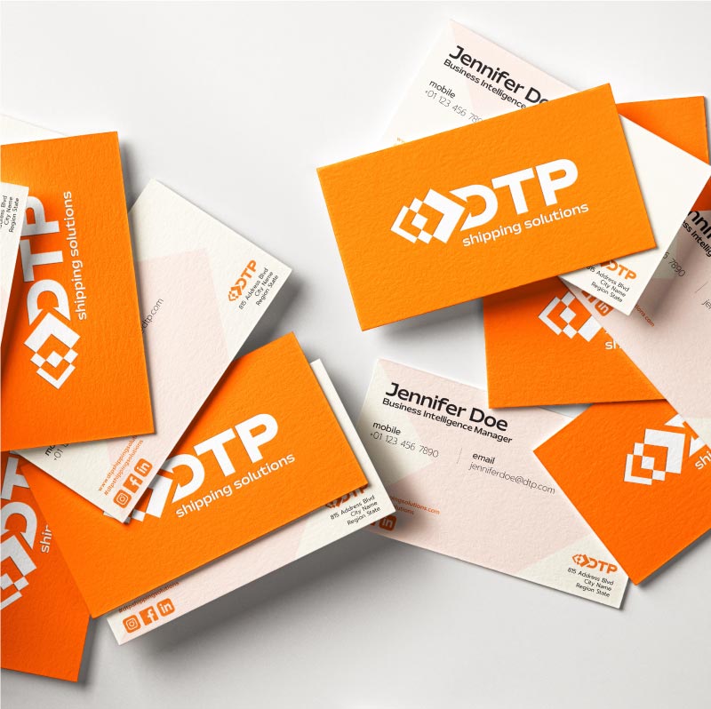
DTP provides B2B services, so with this project the company was looking for a logo that would fit their expansion plan to new states. The logo had to be something that could be recognizable and unique, with a formal and professional look. It also had to be created thinking that it was going to be printed on their entire fleet of trucks and vans, but also on office supplies like pens and paper and thus needs to work well on all of those formats
The Solution
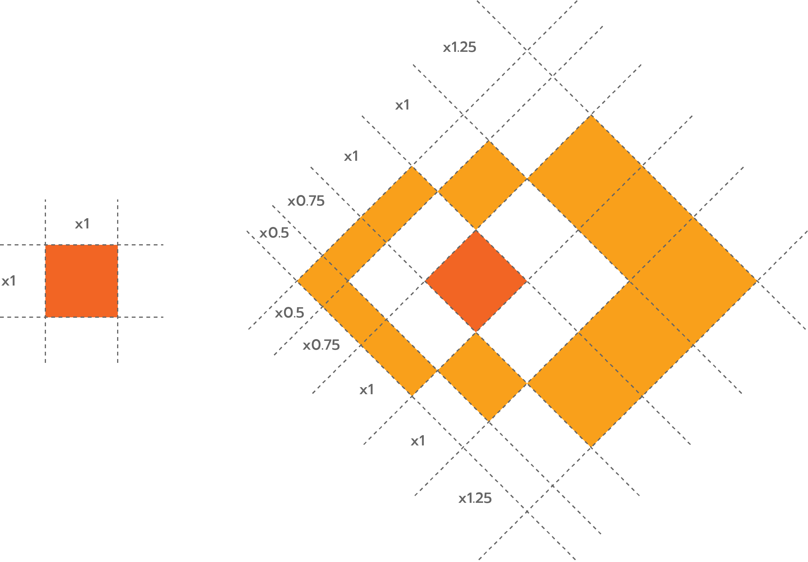
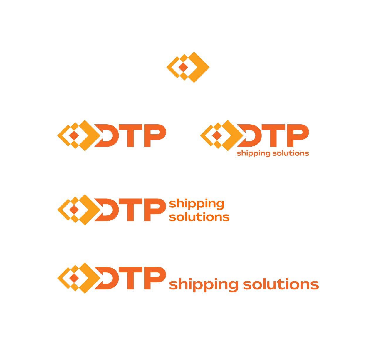
The logo is based on the concept of maintaining a simple shape, thus conveying a sense of movement, to reflect the dynamic nature of the business. The result is the mix of three boxes, overlayed one on top of another, which creates on their main shape two arrows, one pointing left and the other right. The negative space that results from the intersection of the boxes also produces two arrows, giving a secondary reinforcement of the shape. Finally, the wordmark with the three letters (D, T and P) is placed next to the shapes, with the letter D being reshaped by the main logo mark.
Project Overview
Logo Concept

Color Palette
Pantone P 34-8 U
hex: f26524
CMYK: 0, 75, 100, 0
100%
70%
30%
Pantone P 17-8 U
hex: f9a01b
CMYK: 0, 40, 100, 0
100%
70%
30%
Pantone P 179-16 U
hex: 231f20
CMYK: 70, 65, 60, 75
100%
50%
10%

Typefaces
Mattone
AaBbCcDdEeFfGgHhIiJjKkLlMm NnOoPpQqRrSsTtUuVvWwXxYyZz 0123456789Prompt
AaBbCcDdEeFfGgHhIiJjKkLlMm NnOoPpQqRrSsTtUuVvWwXxYyZz 0123456789

